In the previous chapter, we covered the Japanese candlestick, now it’s time to demonstrate how some simple candlestick patterns can be the catalysts for some explosive moves in the market.
When identified correctly, these chart patterns can help traders spot potential market tops or bottoms, and even can signal traders into potential breakouts before they actually happen.
In this chapter we will talk about the most common candlestick patterns that most traders will recognise and incorporate into their technical analysis…
The Double Top
Double top candlestick patterns form after a strong price rally or strong bullish conditions. It is easily identifiable because the double top pattern looks like two mountain peaks that form an ‘M’ shape on the chart.
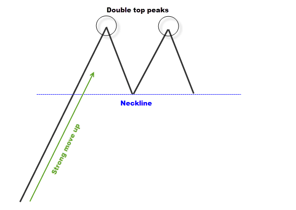
The two peaks will generally be reacting with some strong resistance in the market, demonstrating that the bulls can’t penetrate that level. The initial bullish wave hits the resistance and bounces straight off it, finding support after a market retracement.
Bulls eventually pick up steam again to push the market back into higher prices where the market retests the resistance level. The bulls don’t have enough strength to break through the resistance, and price bounces straight off it again, creating the second peak.
A double top pattern is a classic sign of bullish exhaustion.
The double top candlestick pattern generally signals the market is about to tip over. The containment line for the double top candlestick pattern is called the ‘neckline’, and this is where the market found support after the first peak.
The standard way to trade a double top candlestick pattern is to wait for the second peak to form and then short price breaks below the neckline. But as the saying goes, “there is more than one way to skin a cat”.
Here is an example of a real double top pattern…
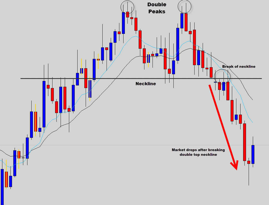
The double top candlestick pattern is great for identifying bullish exhaustion and market tops.
You can see on the chart above, after a long really this market double topped and broke the neckline, which resulted in a very profitable bearish trade.
The Double Bottom
The double bottom candlestick pattern is really the exact inverse of the double top pattern. It forms after strong bearish moves and has a ‘W’ type shape to it.
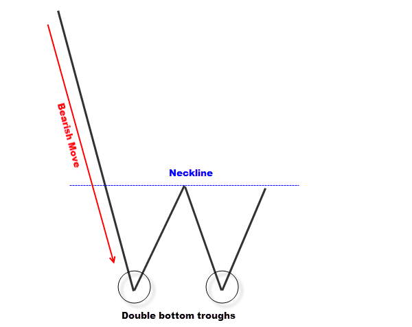
A double bottom signals bearish exhaustion and is formed when the bulls start to take control at a specific support level.
The bears drive prices down into this support level where the bulls step in and drive prices back higher, this bullish rejection of support creates the first ‘V’ shape trough.
The market finds resistance and the bears attempt to drive prices back down. When the market reaches the support level for a second time the bulls step back in again, driving prices higher creating another ‘V’ rejection shape trough.
This final move completes the double bottom candlestick pattern.
The resistance found after the first trough is referenced as the ‘neck line’. When prices push higher through the neckline, the double bottom pattern is completed and triggered.
Take a look at this example of a double bottom…
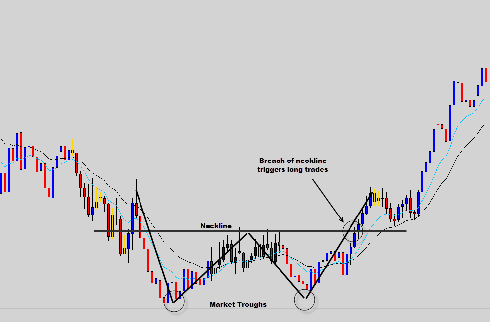
You can see how the market found a support level which the bears just could not punch through.
The bulls held their ground here creating the double bounce, then the final push higher.
Long positions are generally triggered once price breaches the highs of the neckline, after the second bounce off support, but as we said before, there are multiple strategies to tackle double tops and bottoms.
Just don’t get caught up chasing price, have a clear action plan in place.
Double bottoms are great indicators of bearish exhaustion and generally signal the end of bearish trends. Double tops and bottoms are much more powerful when played on the larger time frames.
Head and shoulders
Head and shoulders are another market exhaustion candlestick pattern. This pattern is most reliable forming after the market has been already been trending in a certain direction for a while.
Let’s take a look at a basic head and shoulders candlestick pattern anatomy that forms on top of a bullish move.
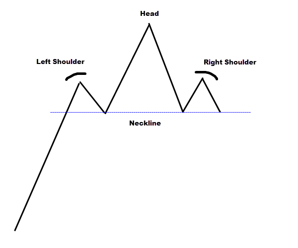
As the name suggests, the candlestick pattern consist of a head and two shoulders. Normal head and shoulder patterns form on top of bullish trends, and just like the double top they signal bullish exhaustion.
The pattern is created when the bulls find a solid resistance level, retrace back and find support which creates the left shoulder. At this stage it’s impossible to tell if a head and shoulders candlestick pattern is forming.
When bulls pick up strength again and fire price upwards punching straight though the last tested resistance, however these higher prices can’t be maintained and price collapses back down under resistance as the result of a false break.
It’s the false break that creates the ‘head’ part of the candlestick pattern.
After the bulls failed to maintain prices above resistance, they muster their strength and try again. Resistance holds and price falls back to support. This last phase creates the right shoulder and completes the head and shoulders pattern.
The containment line which has been acting as support during the whole process is called the neckline. The traditional way to trade the head and shoulders pattern is to go short when the market breaches the neckline after the signal has formed.
Check out a head and shoulders pattern that formed on a real chart…
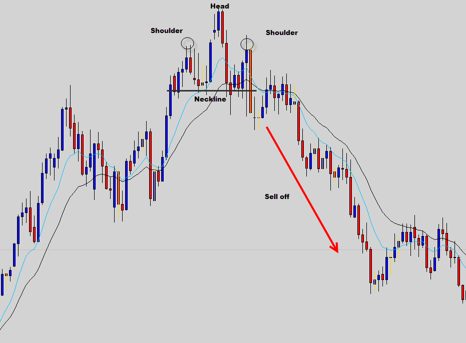
You can see how this head and shoulders candlestick pattern demonstrated the exhaustion of the bulls. When the neckline was breached, this market aggressively sold off. Also note how the head and shoulders pattern formed after a strong bullish move.
The Inverse Head and Shoulders
The normal head and shoulders candle pattern signals and communicates bullish exhaustion. If you flip the pattern upside down you get the ‘inverted head and shoulders’ and this inverted pattern signals bearish exhaustion by operating in reverse.
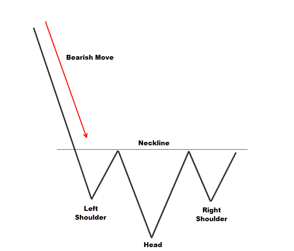
After strong bearish activity; the market runs into support, retraces and finds resistance which creates first phase creates the left shoulder. It’s impossible to tell if the inverted head and shoulders pattern is forming at this point in time.
The bears push the market down; causing a false break, or breakout trap below the recently tested support. When price shoots back up above support it creates the ‘head’ section of the pattern.
The bulls retest the support level. Support holds and price bounces back to the resistive containment line, which is actually the neckline in this candlestick pattern. This also completes the inverted head and shoulder pattern.
The classic way to trade this is by waiting for the market to push above the neckline, this triggers long trades.
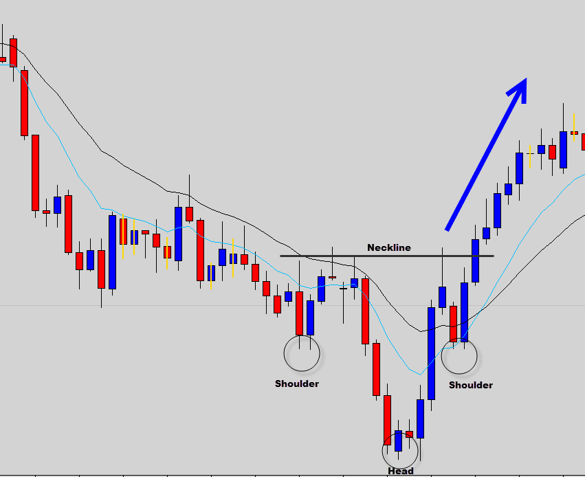
You can see in the above example how the inverted head and shoulder candlestick pattern demonstrated bearish exhaustion and when the bulls broke the neckline containment, it produced a profitable trade.
Ascending Triangles
Ascending triangles form when the market runs into a resistance level and stalls market movement.
Bullish pressure is still strong and continues to build up underneath, compressing prices tighter and tighter with each attempted bounce of resistance.
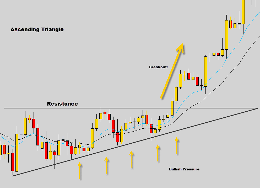
Generally what happens is the bulls eventually build up enough strength and punch through the resistance level just like in the example shown above.
Important: In some cases the bulls can be exhausted during the formation of the ascending triangle, resistance holds and the market can collapse.
Descending Triangles
The inverse of the ascending triangle, heavy bearish pressure jams into a strong support level in the market.
The increasing bearish pressure rejects bullish moves off the support level and compresses price tighter each time.
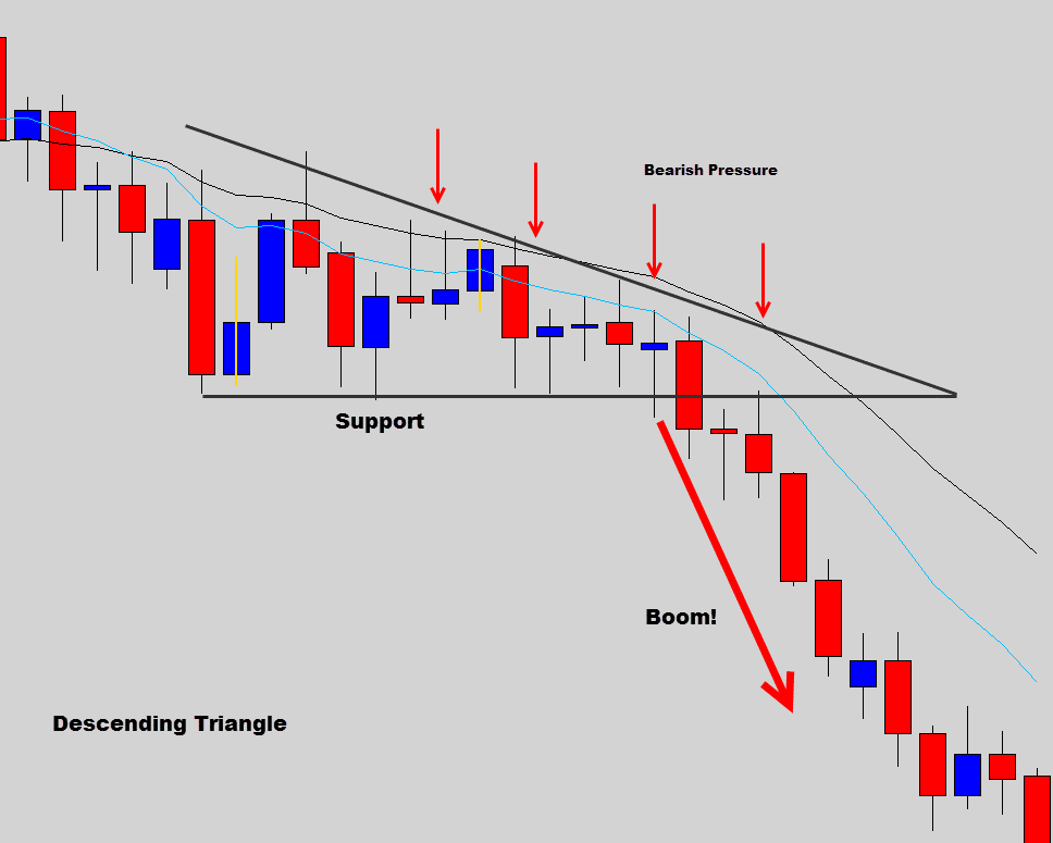
In the chart above you can see a real example of a descending triangle candlestick pattern. The bearish pressure eventually overwhelmed the support line and produced a profitable short trade.
Important: This isn’t always the case; the bears can be exhausted while attempting to break the support level. When the bears are out of steam, the bulls have no resistance and bullish breakouts can occur.
Squeeze Patterns
Wedges form when the market stalls in a period of indecision and starts producing higher lows and lower highs consistently. Eventually this HL LH patterns compresses price into the tip of the wedge that inevitably leads to a breakout.
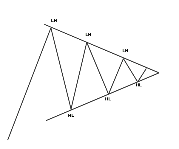
Once price reaches the tip of the wedge, there is a high chance a breakout will occur. Wedges are bilateral, that means they can breakout in either direction.
So the classic way to trade wedge breaks is to buy breakouts out the top of the wedge and sell price breakdowns below the wedge.
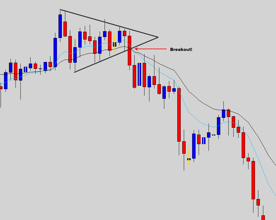
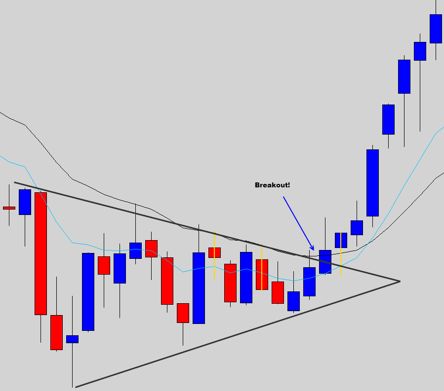
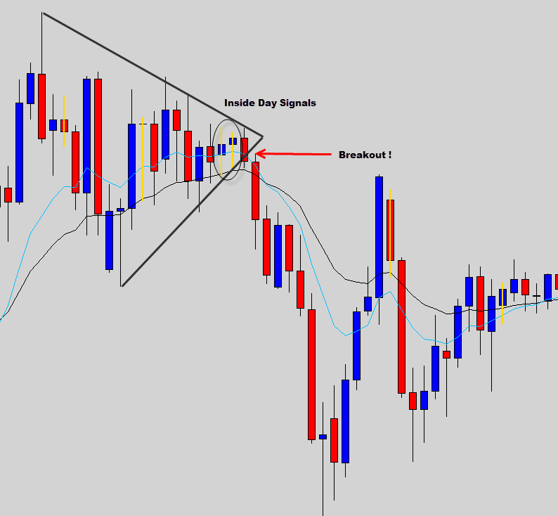
In the examples shown above, we can see once price was compressed into the wedge tip price broke out either the top or bottom of the wedge pattern.
If we traded in the direction of the breakout here we would have caught some nice moves.
Flags
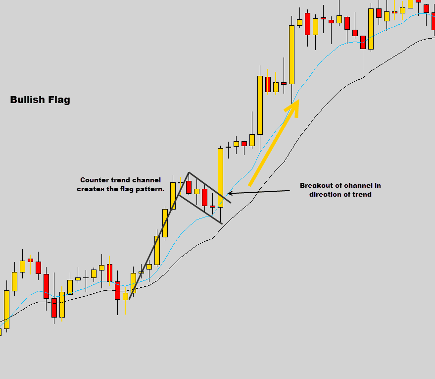
Flags form when the market retraces during trending conditions and are used as trend continuation patterns.
The counter trend movement creates a small channel, when price breaks the channel in the direction of the trend, the continuation trade is triggered.
Using Chart Patterns with Price Action
Trading chart patterns like the ones discussed in this chapter can be profitable, but we like to combine our price action signals with these charts patterns to add confluence to our trades, creating higher probability trade setups.
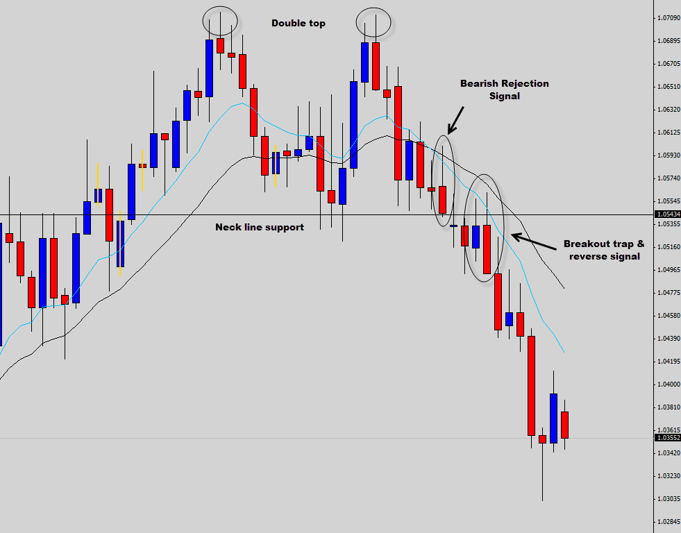
In the example above, the chart had formed a double top pattern.
A bearish pin bar signal was communicating future bearish price action right on the neckline support.
After price had broken the neckline, the market retested the neckline support as new resistance and produced a breakout trap & reverse trade. The double top reinforced our trade setups and our bearish bias.
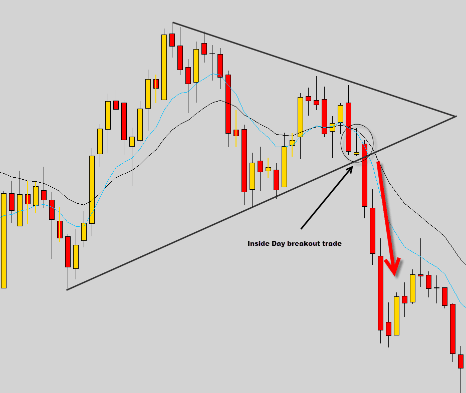
The chart above demonstrates how an Inside Bar breakout signal got us into the wedge pattern breakout.
Because of the Inside day price action signal, we were able to trade this wedge pattern with a tighter stop and produce a higher risk/reward trade.
To learn about our price action signals and how to combine them with chart patterns, check out our advanced Price Action Trading Course.
In the next chapter of our beginners course. We will be looking at some of the price action signals we use to trade.

Saviera_billionaire
Will be downloading this as html file. After 6 years trading i finally have that lightbulb go off in my head as my own methodologies click up.
keletso maapea
what if i got a 3 dobuleup and i got a uptrand boom why…
Replying to: keletso maapea
Saviera_billionaire
Backtest and find at least 30 other times you got this. That gives you enough repetition to trade and trust in your actions
Ronnie
very legit info
Adelle Gascoyne
Thanks for this article. It provides good insights for people new to trading.
kabelo
grea t stuff,but i think i cant even grasp topics you highlighted just now and im into forex iq option platform how does one get to have an overview of nuggets of
VUYANI
GOOD JOB
Sarath
Excellent post, I learnt a lot from it, keep it upThank you
Sarath
Senzo Majozi
very interesting chapter, keep it up
Mera Paad
Lovely charts – even I can see how the system works.
MOHIT
from this ,one can expect lots of interesting things in the course.
mohamed
Hello,
are you focus in the course in the chart pattern or the PA signals
Replying to: mohamed
Dale WoodsAuthor
Hi mohamed, we focus on price action signals and money management in the war room.