This week we are driving the scalpel into the Directional Movement Index indicator, generally known as DMI for short.
In this article we are going to slice open the Directional Movement Index, find out what makes it so popular, how traders apply it to their market analysis and how we can achieve the same goal with indicator free price action trading.
The DMI was invented by J. Welles Wilder, who also was the father of the popular ‘Relative Strength Index’ indicator. Wilder first published the concept of the DMI in “New Concepts in Technical Trading Systems”, ever since traders have been using it with their technical analysis.
At a glance the Directional Movement Index graph looks like a 2 year old child’s drawing, but we won’t let that intimidate us. So let’s continue with the autopsy report, break down our findings and try making some sense of the DMI.
So what does the Directional Movement Index do?
When you first load up the Directional Movement Index onto your charts it will ask you for the input period value used for its internal calculations.
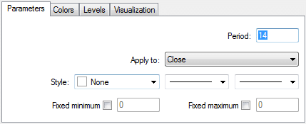
The input value determines how many candles are used in the Directional Movement Index calculations, the default is 14. Once the indicator accepts your input parameter it proceeds to open up its own indicator window at the bottom of the price chart.
You will see two lines inside the new indicator window, usually colored green and red.
- The Green Line represents the +DI Output.
- The Red Line represents the -DI Output.
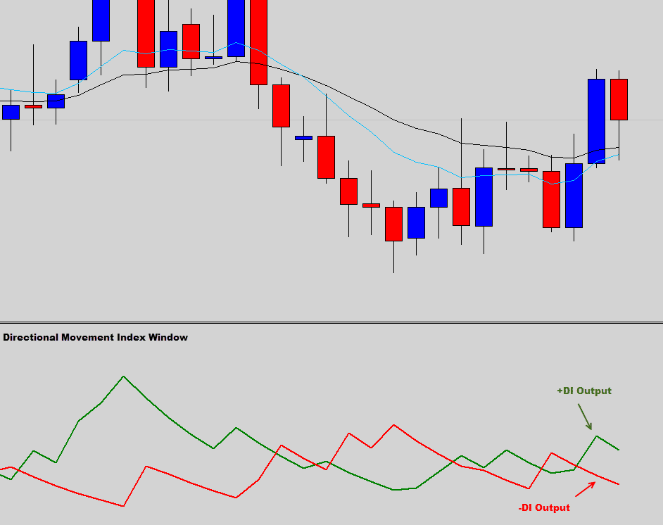
The sole purpose of the Directional Movement Index is to determine market trend direction and strength. It achieves this by using a lengthy formula that outputs the two +DI & -DI values.
These values range between 0-100 and are designed to quantify trend strength, but these lines could be easily be misinterpreted as a heart rate monitor from a stressed out trader.
The Autopsy
When we ripped this indicator apart we realized that the formula driving the core function of the Directional Movement Index looked simple enough, but when you break it down into its smaller components it looks like something Einstein would use in his calculations of general relativity.
Here are the core formulas used to determine the Directional Movement Index values.
- +DI =(+DM EMA / ATR) * 100
- -DI = (-DM EMA / ATR) * 100
Now we had to order some pizza into the autopsy lab and work some overtime to analyze these Directional Movement Index formulas, they needed to be broken down and explained in stages.
Stage 1: Compare some candle data
The first stage is the work out the +DM & -DM values.
- UpMove = today’s high − yesterday’s high
- DownMove = yesterday’s low − today’s low
This first stage basically compares the highs and lows of each candle in the period set by the user. Remember the default is 14.
Stage 2: Run the data through some logic.
The second stage is to use the compared data from the first stage and pass it through some basic logic to get our final DM value.
- if UpMove > DownMove and UpMove > 0, then +DM = UpMove, else +DM = 0
- if DownMove > UpMove and DownMove > 0, then -DM = DownMove, else -DM = 0
Once the DMI indicator completes the logic to resolve the final DM values, the last stage of the formula can be completed to find the Direction Index Value (DI), which is what you see on the chart.
Stage 3: Mash the calculator keypad some more
- +DI =( +DM EAverage / Average True Range) * 100
- -DI = (-DM EAverage / Average True Range) * 100

If you think this gives you a headache, think about the times before computers existed and traders were manually working out these values on desk calculators. By the time they finally got through the entire math they might have missed their trade.
But don’t worry; these formulas are not something that you need to know. In fact the indicator just needs to be loaded onto the chart, and you can simply make observations or trading decisions by the conveniently pre calculated outputted DI lines, much easier!
So let’s move on and see how traders use the DMI in their trading.
How DMI is typically used in the markets.
The Directional Movement Index is a trend strength and direction tool, traders can determine both these characteristics by looking at the +DI and -DI lines that are displayed in the Direction Movement Index window, generally located at the bottom of the price chart.
The +DI line is a quantified value of bullish strength.
- +DI values under 25 indicate weak bullish activity.
- +DI values around 25 indicate some bullish pressure.
- +DI values over 40 communicate a strong bullish trend in place.
The -DI line is a quantified value of bearish strength.
- -DI values under 25 indicate weak bearish activity.
- -DI values around 25 indicate some bearish pressure.
- -DI values over 40 communicate a strong bearish trend in place.
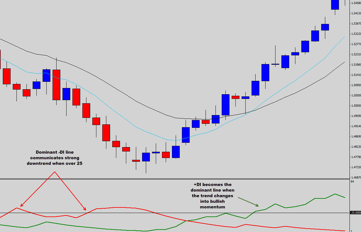
The simple strategy is to wait for either the +DI to cross over 25 and go long, or wait for the -DI to cross over 25 to be signaled to short the market.
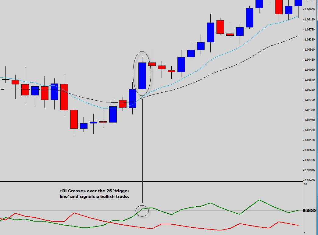
If a trader was using the ’25 cross strategy’ the chart above demonstrates an example when the Directional Movement Index would have signaled a bullish trade.
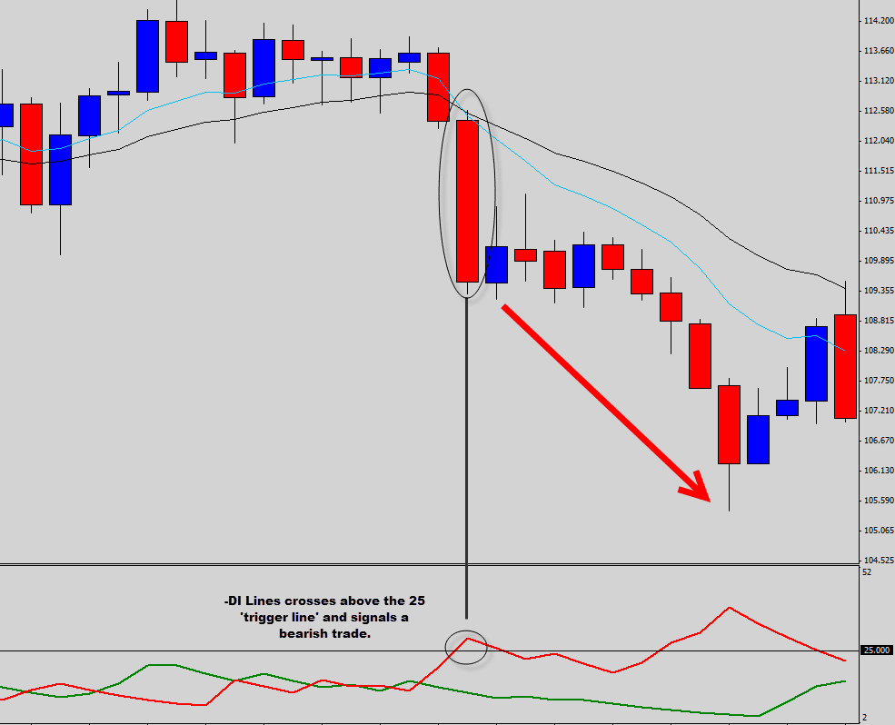
The chart above demonstrates a ’25 crossover’ bearish trade triggered when using the 25 DMI line as a trade trigger.
Another strategy is to use the direct crossing over of the +DI and -DI, depending which is the dominant line performing the cross is the direction that the trader is signaled to trade in.
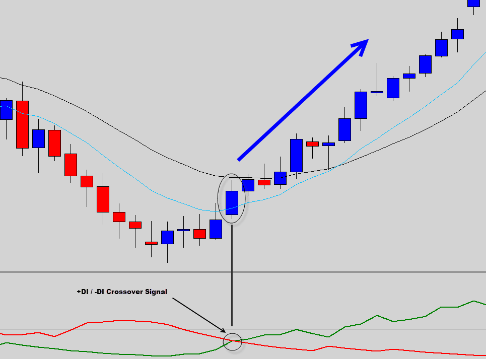
In the example above, the +DI line crossed over the -DI. This signaled the trader into the start of a bullish trend.
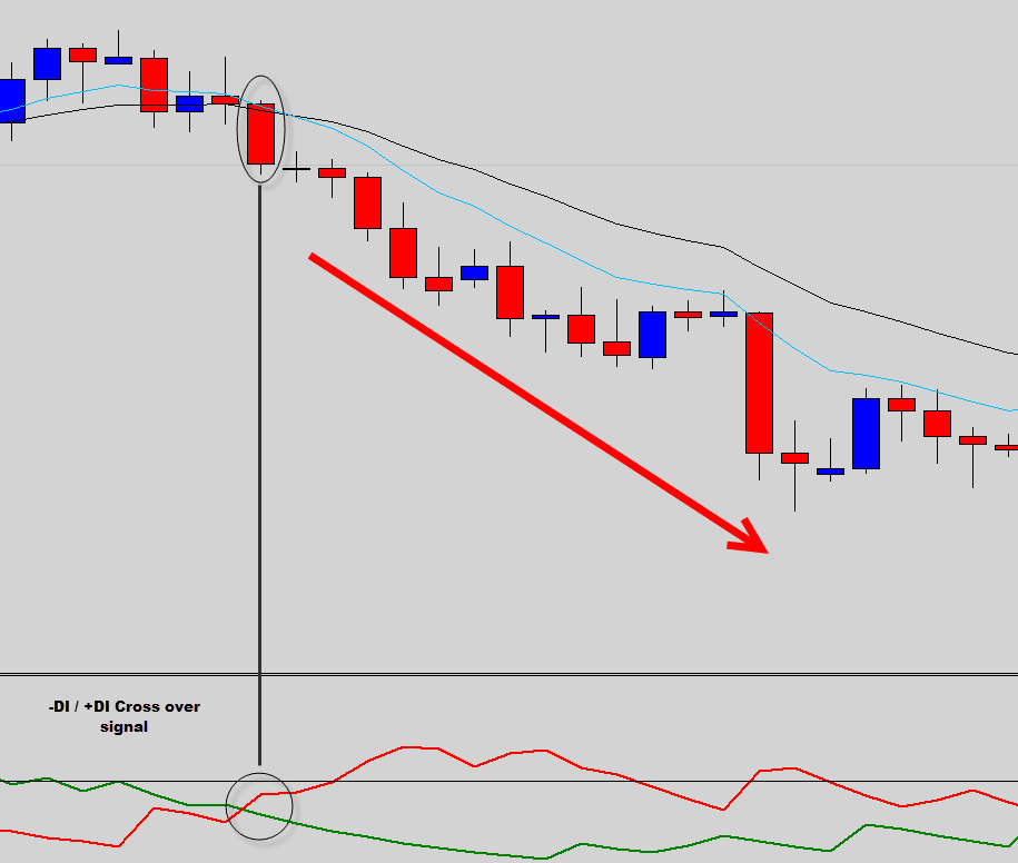
The chart above shows a bearish DMI crossover signal when the -DI crossed above the +DI line.
Why we don’t like it
Where do we start, well first those perfect trade examples were just cherry picked trades from chart history when the chart conditions were perfect to allow them DMI strategies to work at their best.
Now we are going to show you how this indicator performs during typical market conditions.
Let’s take another look at that 25 Directional Movement Index line cross strategy…
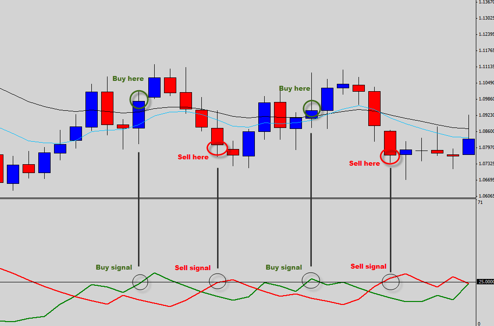
Above is an example of how the 25 Directional Movement Index line cross strategy typically works in normal market conditions. Signaling the trader to buy the top and to sell the bottom, it’s not exactly detecting strong trends like it is designed to…
So how about the +DI / -DI line cross strategy, how does that fair in the real market?
Let’s have a look…
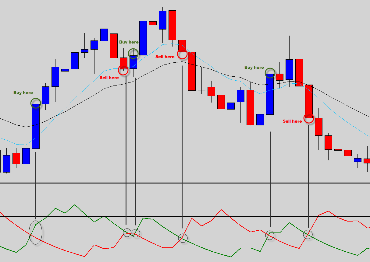
Surprisingly, the random chart situation we picked for the crossover strategy actually provided better trade signals than the 25 cross strategy we showed prior to this. Some of the trades did move into some profit.
However, we still cannot see how this strategy is profitable and here is why…
Every smart trading plan uses good money management, at The Forex Guy we use a positive money management strategy, which means we always aim to return 2-3 times what we have risked on each trade.
Let’s say we were to use the crossover strategy above, then the above buy signals use the low price of the trigger candle as our stop loss setting, and the highs of the bearish trigger candles for our stops in those trades
None of these trades ever reached 1:2 risk/reward.
That means the trader would have eventually been stopped out on every trade or at least broke even on the ones that did start to work out. Either way this strategy would have resulted in a net loss.
The price action way
We know that the DMI was designed to determine trend strength by passing candlestick high, low and close data through a series of mathematical calculations and logic statements.
You don’t need mathematical calculations to identify a market trend. The Directional Movement Index uses price action data to try to quantify a trend, so why don’t we just cut out the DMI and use the raw price action data ourselves to establish trend direction.
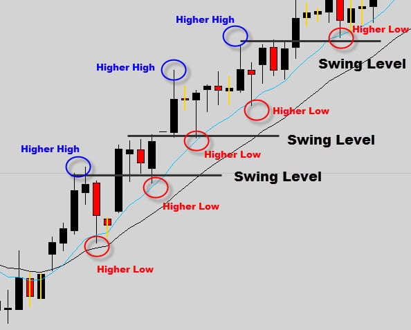
Trends are easily and quickly identified by successions of higher highs and higher lows (uptrends), or, a succession of lower highs and lower lows (downtrends).
A Bullish Trend…
A Bearish Trend…
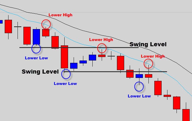
We wait for weakness in a bullish trend and buy in via a price action signal at the trend swing levels, or we wait for signs of strength in bearish markets and sell price action signals that form at swing levels.
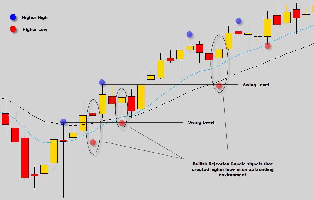
In the chart shown above we can quickly identify the uptrend by observing the higher high and higher low pattern.
By waiting for weakness in this uptrend and using a price action signal to trigger us into the trade we are able to take advantage of excellent market prices for trade entry.
This is much more effective than using the DMI outputs, as the Directional Movement Index signals will typically signal you to buy in at high prices and sell the market at lower prices. This leaves your trade exposed to being hit by market retracements, because we all know the market doesn’t move in straight lines.
By making the switch to price action trading we can easily arrange a funeral for this oscillating crossover nightmare known as the Directional Movement Index. It’s time to start trading smart and start trading what you see, not what has been mathematically churned out for you.
Once you throw away your indicators and clean up your chart from any mess you will really start to look at the charts in a whole new light. Clean price charts really start to bring out clarity in the markets, and by using price action trading techniques your confidence in the markets is going to dramatically improve.
If you would like to learn more about our professional price action trading methods, best forex signals or our powerful money management plans, then feel free to check out the Price Action War Room information page.
We hope you found this report useful, we will see you at the next indicator funeral.

simon
very good indicator
Vlada
Bice and grate article .thanks