Today we cut open the Average Directional Index, a well known tool in the indicator trading community.
The Average Directional Index is abbreviated ADX for short.
We are ripping open the Average Directional Index to discover what are the driving components inside this indicator that make it go. We will also discuss why traders may choose use it in their trading systems and how we can do better with price action trading techniques.
But first, it’s important to know that the Average Directional Index is actually built on top of the DMI Indicator, so before we move on with the Average Directional Index autopsy, it’s important that you’ve first read and understand the Directional Movement Index Autopsy, otherwise this report will may confuse you more than a chameleon stuck in a bag of Skittles.

What does the Average Directional Index do?
With the DMI in the main driver’s seat here, there are going to be some similarities between the DMI and ADX. Due to this tight relationship, the two indicators are generally bundled up together in the same indicator package.
You will generally find the bundled package listed under the ADX indicator in your charting terminal’s indicator list. When you load the Average Directional Index indicator onto your chart you’re going to be asked for the input period.
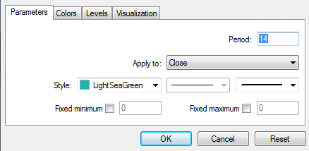
Like most indicators the input period is how many candles are passed into the guts of the indicators core algorithm for data processing.
When you load up the Average Directional Index indicator you’re going to end up with a display similar to this.
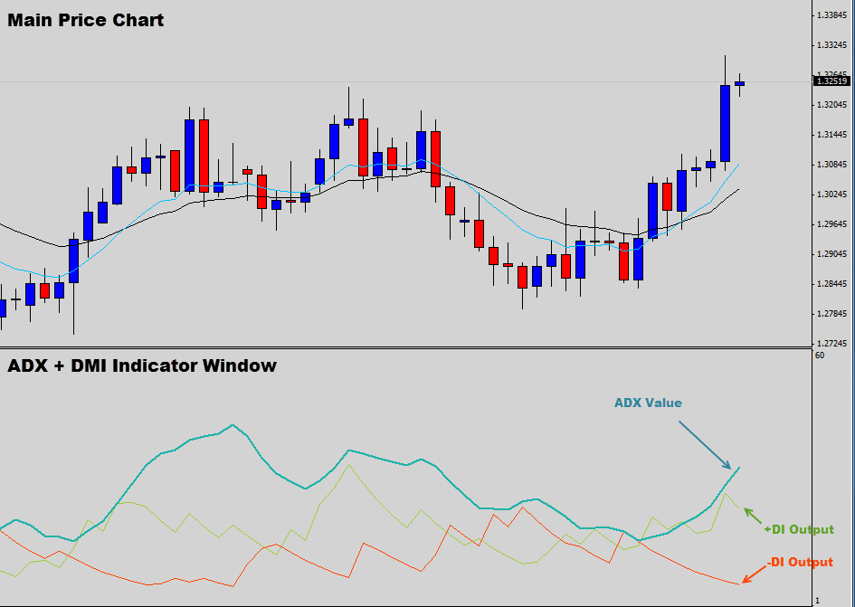
The Average Directional Index opens up in its own separate indicator window and displays 3 lines.
This is an oscillator based indicator so the values of these outputs range between 0-100, anything down near 0 is a weak value and anything up towards 100 are strong values.
You will notice the familiar +DI and -DI values, these are the outputs from the original Directional Movement Index. The new Teal output is the ADX value that we are going to be focusing on in this report.
How is the ADX used in the markets?
The Average Directional Index is a momentum indicator; this means traders will use the value of the Average Directional Index output to determine trend strength, or try to spot an emerging trend by increasing ADX levels.
Traders must remember that the Average Directional Index value is an absolute value; this basically means that it will never go below zero. So it doesn’t matter if the charts trending up or down, the ADX will still output a positive figure.
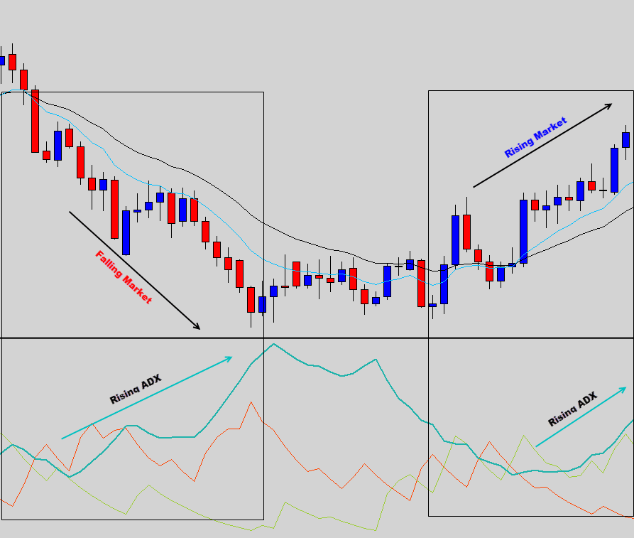
Notice how the ADX doesn’t care if the chart is falling or rising in the chart above, the Average Directional Index always remains positive. The main function of the ADX indicator is to quantify the trend’s strength with a number.
Even though the ADX’s oscillating range is between 0-100, the Average Directional Index generally prints values between 10-60.
ADX analysis believe values under 20 indicate a weak trend, whereas higher reading around the 40 mark indicator a fairly strong trend. When the ADX prints value up near 60 you’re basically looking at a runaway freight train.
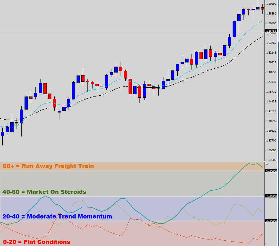
Above is a visual representation on how traders generally relate the Average Directional Index values to the market. Basically anything over 20 is meant to indicate building momentum and signal ‘it’s ok to trade’.
We had a look around and found a consistent simple Average Directional Index trading strategy that the ‘ADX gurus’ are recommending. Traders must wait for the ADX line to climb from under 20 and cross over.
Go long if the +DI is above the -DI line.
Go short if the -DI is above the +DI line.
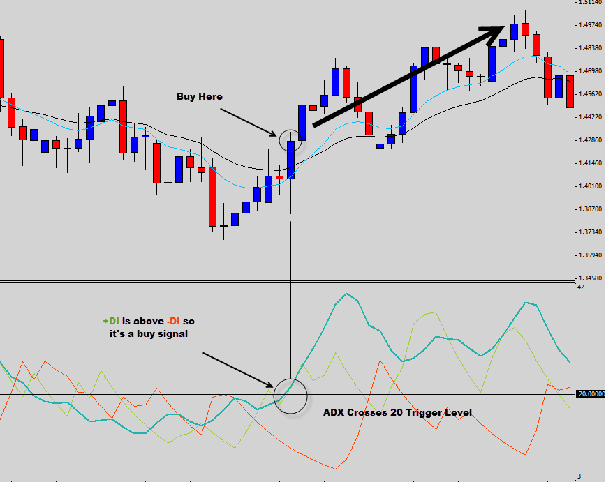
The Average Directional Index crossed the 20 trigger level and signals a buy trade. The market eventually pushed upwards in line with the signal.
Let’s have a look at a short trade example using the 20 trigger line.
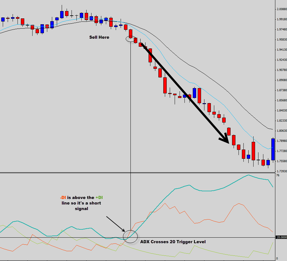
When the ADX line crossed the 20 level this time the -DI was above the +DI so a sell signal was triggered.
We now have a general understanding of the ADX, what it’s used for and how traders are applying it to the market.
Now it’s time for the fun part, where we cut it open and reveal what’s actually the driving force of this indicators operation.
The Autopsy
As we stripped down the layers of the Average Directional Index for a full analysis, we noticed that there were two other integrated systems which we were already familiar with.
The Directional Movement Index and the Average True Range indicators are interconnected with a few other bits and pieces to make up the ‘ADX system’; it’s almost like a Frankenstein Indicator.
The main formula that calculates the ADX output is as follows…
ADX = 100 * EMA of the abs((+DI – -DI) / (+DI + -DI))
So it’s pretty easy to see what this formula does right? Can anyone explain to me what’s going on here?

Sigh… Ok let’s break down the formula.
What we’ve basically got here is 3 separate formulas and some moving average calculations mashed into a mathematical monstrosity.
Stage 1 – We need the Average True Value.
True Range = max[(high-low), abs(high- prev close), abs(low – prev close)]
Average True Range = Average*True Range [Period]
Stage 2 – Work Out the Directional Movement Index Values
Sub step A Calculate +DM & -DM values
UpMove = today’s high − yesterday’s high
DownMove = yesterday’s low − today’s low
if UpMove > DownMove and UpMove > 0, then +DM = UpMove, else +DM = 0
if DownMove > UpMove and DownMove > 0, then -DM = DownMove, else -DM = 0
Sub Step B – Grab the +DI & -DI Values
+DI =(+DM EAverage / Average True Range) * 100
-DI = (-DM EAverage / Average True Range) * 100
Step 3 – Now we can calculate the ADX
ADX = 100 * EMA of the abs((+DI – -DI) / (+DI + -DI))
Then your math’s teacher asks you to grab your desk calculator and work this out by hand…

So to break all that heavy math down into laymen terms, the Average Directional Index compares the Directional Movement Index +DI & -DI values. Then to ‘smooth out’ the results, these values are passed through some averaging math.
Notice how the ADX line is much smoother than the +DI and -DI lines.
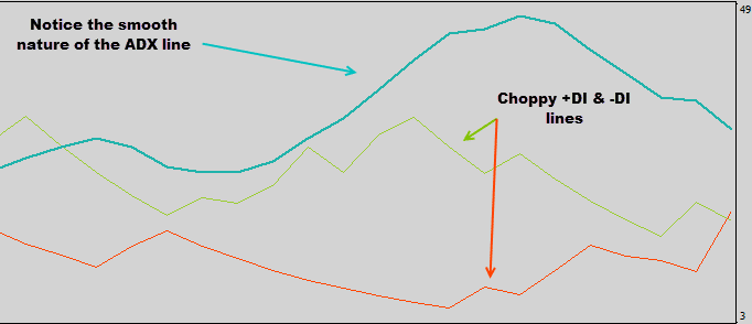
So in a nutshell, this is one indicator upon another EMA upon another indicator upon another EMA… you get the point.
J Welles Wilder (the father of ADX) put all this math together with the intention of creating a more stable indicator that provides us with a reading that is smoother than a baby’s bottom.
Why we don’t like the ADX
Well firstly when we look at the Average Directional Index, we know we are meant to see this…
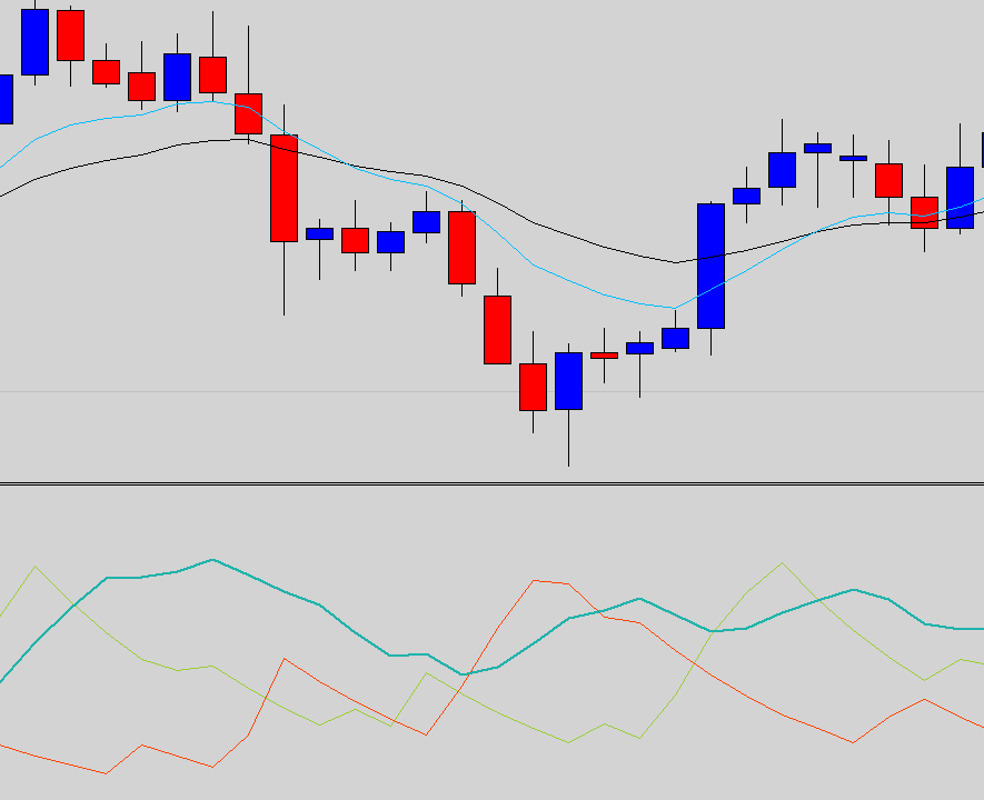
But what we actually see is this…
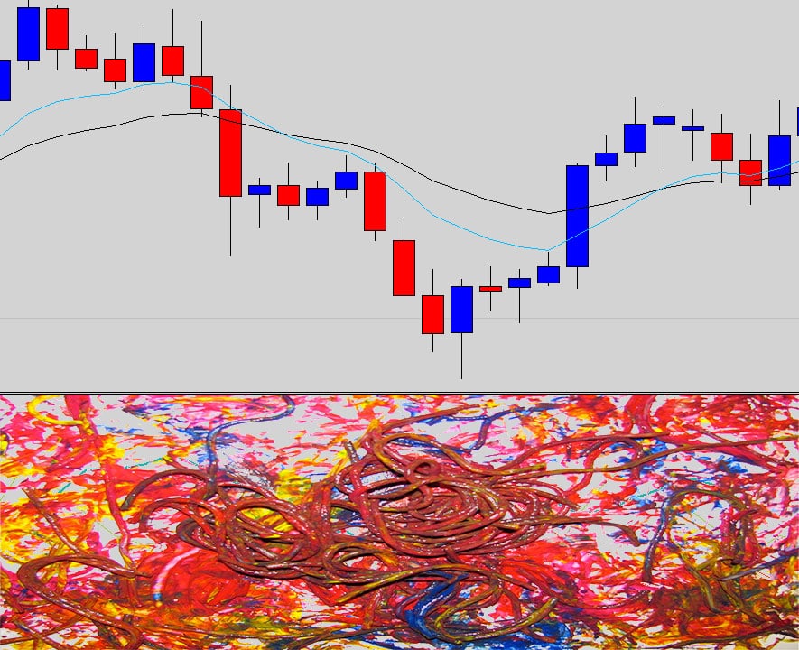
This is nothing more annoying than a messy chart, the ADX cramps up the chart with lines that looked like spaghetti on the screen. No one wants to sit there and have to make sense of that. We prefer to look at the clean price chart and make our trading choices from reading and interpreting the candlestick movements.
The other big problem with the Average Directional Index is the amount of math involved.
As we just discovered, to get the ADX value we need to…
- Grab the Average True Range indicator value (which contains moving average math)
- Grab the Directional Movement Index Values (which contains moving average math)
- Pass this data into the Average Directional Index formula (which also contains moving average math)
That’s THREE times the candlestick data is churned around and passed though moving average calculations.
It’s no secret that moving averages lag, so you can image what’s going to happen when data is passed over a moving average three times.
The most obvious failure of this indicator is that when it shows a strong trend is in place, the trend has already dissipated and is at the peak of its move. So to enter the trade when the ADX signals to, the market is usually at the peak of its strength is like trading into a resistance.
Let’s go back over that ADX 20 cross over strategy that many traders are told to use again. This time we will show you what is most likely to happen.
A buy signal occurs right at the top of this move. The ADX is meant to be a trend strength indicator; unfortunately it’s often late to the party.
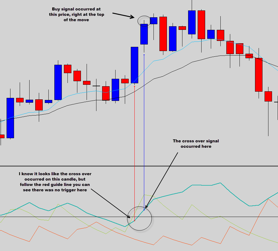
Below is a typical ADX sell signal…
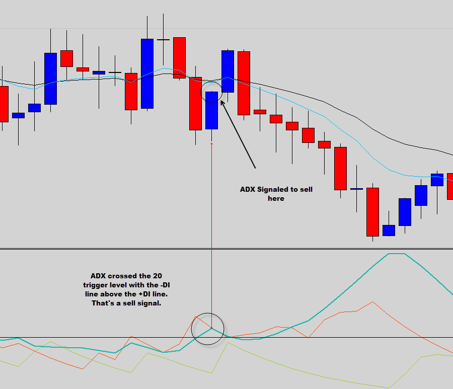
This sell signal from the Average Directional Index got us into a bad trade here, depending how wide your stop loss was you probably would have gotten stopped out.
Remember all the chart examples here are from the daily time frame, and the daily time frame is the most stable. The trader would have had to sit through a full day’s movement into the negative.
To be fair the ADX can occasionally signal a trader into some nice movements, but you just don’t know when the Average Directional Index is going to work and when it isn’t. The problem is the ADX produces way to many bad signals to make up for the good ones it produces.
The price action way
To find the strength of the market we do not have to wait for the ADX to show us a +40 reading.
In the Price Action Protocol Trading Strategy we use 2 exponential moving averages on the chart to print out the trend mean value.
The mean value can tell us a lot about a trends strength, and can even tip us when trends are exhausting.
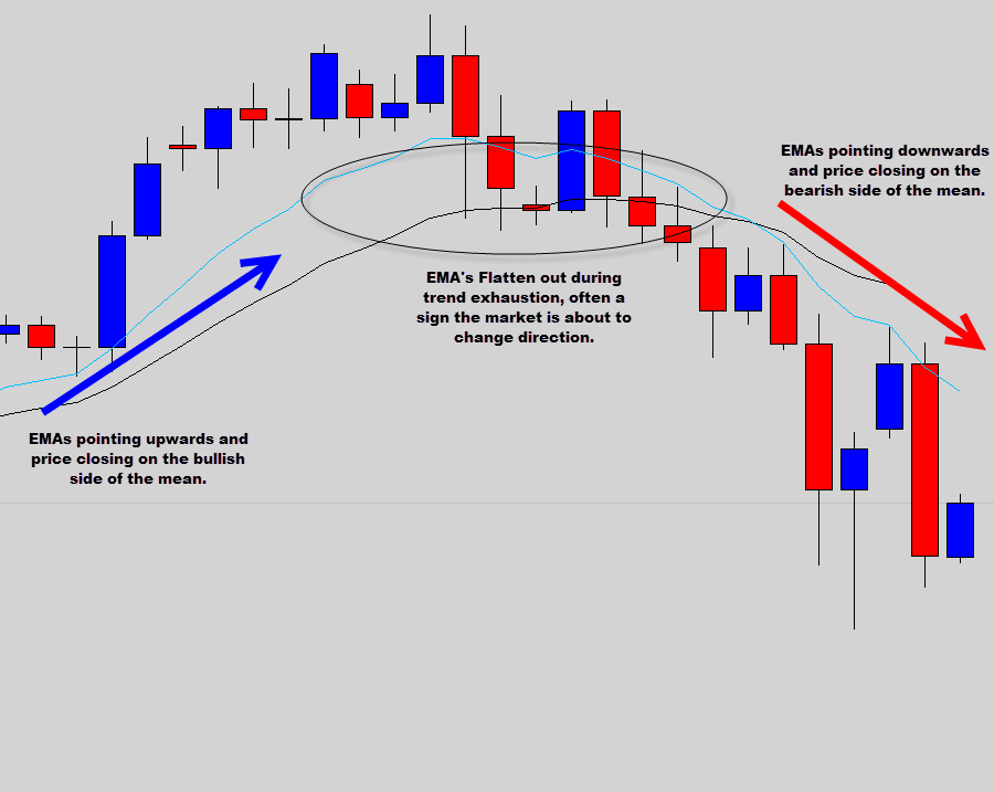
The chart above is the USDJPY daily chart. This market has been on a large scale uptrend, but recently the EMA’s that print our mean value have flattened out.
This is an early sign to trend exhaustion. The daily candles started closing on the bearish side of the mean value and the EMAs started to point downward, an early tip off to the start of a bearish trend.
This set the chart up with bearish dynamics. Many War Room members were able to capture a nice bearish move here by using this type of mean value analysis and confirming a trade with one of our Price Action signals.
Below is the EURUSD daily chart, you can see how our mean value analysis can really give us the edge in determining market direction.
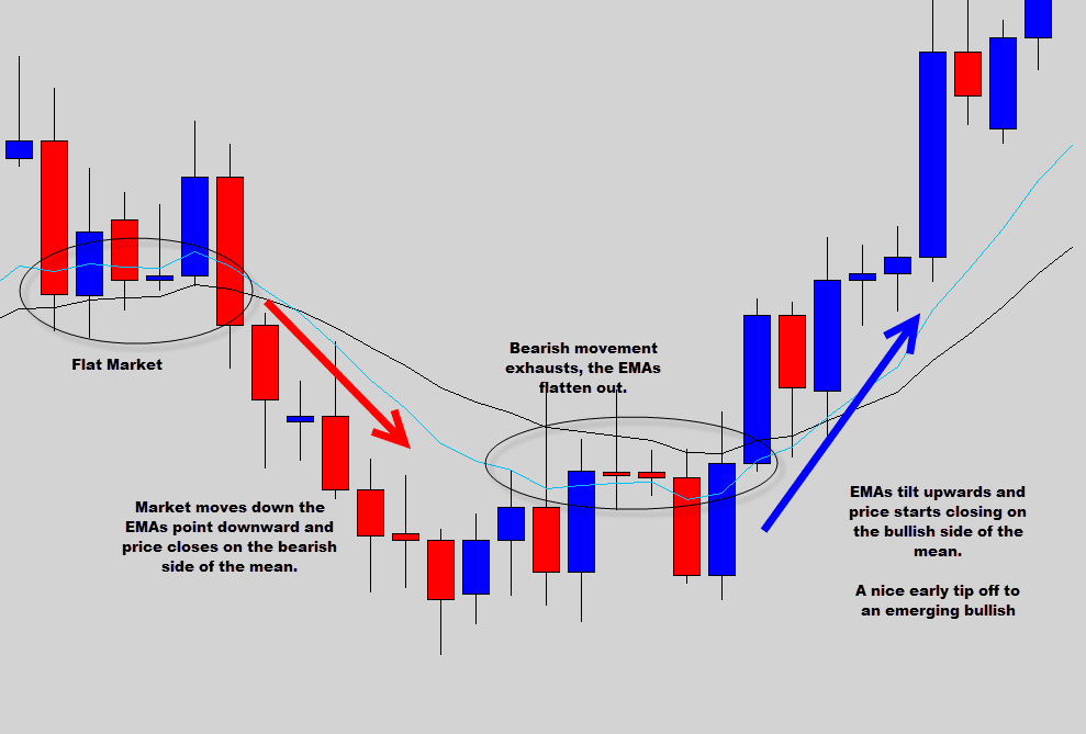
Once we’ve established market direction we can then use the price action signals that form in the same direction of the overall market movement to give us high probability, minimum risk trade setups.
Well I think we’ve made our point here, it’s time to wrap up this ADX corpse and put the ADX in the ground.
If you would like to learn more about price action trading, mean value analysis or the price action signals that we use, then check out our Price Action Protocol trading course information page.

mohamed sadiq
ema details and adx setting
Dave
Just like all other opinionated articles of self-mentioned gurus on the internet. Look again at your own examples, the ADX shows exactly the same as what you say with 2 MAs. You look at the slope of the MAs but conveniently not at the slope of ADX.
At the end every technical analysis is the same. It is only from which angle you look and how you interpret it.
Replying to: Dave
Dale WoodsAuthor
That is the point of the article Dave… showing that you don’t need the ADX on the chart.
msno
thank
Vidyadhar Belvalkar
Expecting the autopsy of a few more most popular indicators like MACD, MACD histogram, Bollinger Band, Parabolic SAR etc.